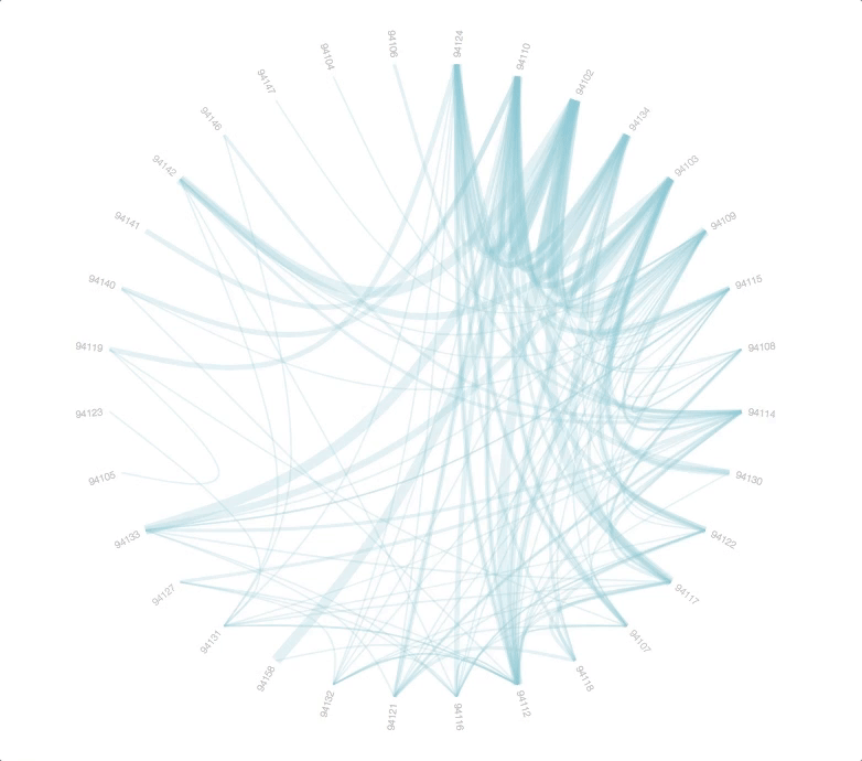
This is a visualization inspired by the Anti-Eviction Mapping Project, a data-visualization and digital storytelling collective working to document the housing crisis in the San Francisco Bay Area in California.
Click the image to view.
dec 2015
This is a visualization inspired by the Anti-Eviction Mapping Project, a data-visualization and digital storytelling collective working to document the housing crisis in the San Francisco Bay Area in California.
Click the image to view.