This is an interactive map inspired by the Anti-Eviction Mapping Project, a data-visualization and digital storytelling collective working to document the housing crisis in the San Francisco Bay Area in California.
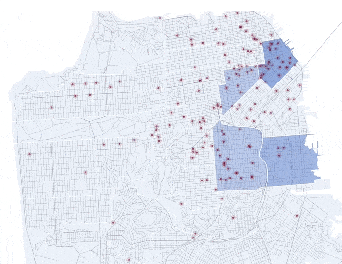 map of coffee shops and average monthly rent in San Francisco, 2010-2015
about
Each red dot on this map represents a coffee shop. Using the sliding timeline, users can see the year a given coffee shop opened. The dots are hyperlinked to the Yelp page of the coffee shop it represents. The opacity of the neighborhood background corresponds to the median rent of a one-bedroom apartment — the higher the rent, the darker the blue.More information about the map, my motivation in creating it, and data collection methods for the map can be found on the live page.